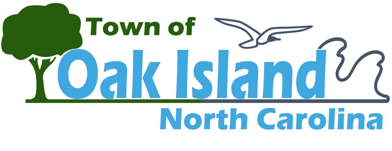
The current Oak Island Logo (pictured above) was adopted by the Town Council during their regular meeting on October 12, 2021.
Prior to the adoption of this logo, the Town had used the Town Seal for all promotional, legislative, and administrative materials produced. While this served the purpose for most activities, the need for a simple, yet unique way to visually represent the Town steadily become more apparent over time.
While they equally represent the organization they serve, a seal and a logo are two distinct properties, with two very specific purposes. A town's seal is an intricate, ornate design that tells the history of the town, and is useful for all legal documentation such as resolutions, ordinances, and proclamations. A logo on the other hand provides a simple, yet well thought out design which allows the town to be immediately recognizable on promotional media such as apparel, vehicle branding, and signage.
The logo approved by the Town Council, nicknamed the "tree to sea" design, strives to encapsulate the aspects that define the Town of Oak Island. It uses a color scheme derived from the Town Seal, and prominently displays the Town name, surrounded by a live oak tree on the left, and gentle waves on the right. All watched over faithfully by the ever-in-flight seagull above. Below, it features the the state name, to further distinguish the Town from some other "cursed" oak islands, along with an updated version of the Town slogan "A Place to Coast."
Along with the new logo, a "Logo & Seal Usage Guide" was adopted as well. This provides vendors and partner organizations with exact details on color and sizing requirements, to ensure the logo is always correctly displayed. Below are breakdowns of both the Logo and Seal, which briefly explain their various parts, and how they are expected to be displayed. Select each image to view them in full size. For more information on the Logo, Seal, or any publication tools from the Town, contact the Communications Office using the CONTACT FORM.